Graphics - Need Your Feedback!

Robert

Stay Frosty!
Jan 2, 1999
20,574
341
83
dr1.com
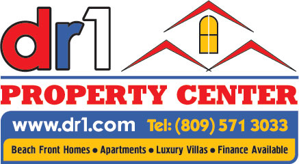
I asked a few companies to supply me with some graphics that will eventually be used on vehicles. The idea of the graphic is to identify that it's the DR1 Property Center, a real estate company and also make it easy for people to write down the web address or phone number.

As you can see, the quality of work and "putting down" of my ideas varied :)

Take a look at the samples below and let me know what works and what doesn't. I have my own opinions, but prefer to have some group feedback.
Feel free to say what looks like complete rubbish and what looks good etc.


#1
1.jpg


#2
2.jpg


#3
3.jpg


#4
4.jpg
 

hifiman

New member
Jul 13, 2005
396
2
0
I like #4 but think it could use a bolder font. #2 is to busy and I don't think it can be read at a glance.
I think short with minimal colors is always best.
hifiman
 

jrzyguy

Bronze
May 5, 2004
1,832
22
0
heh..i am a graphics op for a living...and i liked #2...then #3...dont like the font on 1 at all...

I like the roof on top of DR1 and the other stuff. Granted..less is more and it is kinda busy. If it for the web (and you might be dealing with people with 15" monitors)..then simpler is better.
 

jrzyguy

Bronze
May 5, 2004
1,832
22
0
and scrap "people before profits" unless you can really read it.

the slogan works if you dont have all the other stuff cluttering up the space.

do you really look at a slogan under a logo on a web site? nope...in under 5 seconds i need to know if this has the information that i am looking for. Slogans are better for branding products that are actualy going to print or packaging.

i still think i would work on simplifying #2...it "pops" to me.

can i have a shot at this?

Ok...looked at them all again...the TOP half of number 2 yes...the bottom is too busy....combined with the some of the elements of the bottom of number 3 and you have a winner!
 

azabache

New member
Apr 25, 2006
451
0
0
I like #2 the best because the telephone number and website address are the biggest and easiest to see.
 

johne

Silver
Jun 28, 2003
7,091
2,965
113
If for a moving car, van, etc....

none of them. Sorry. Reasons:
1) Web address and phone # on same line not good for moving car.
2) " '" " " " not large enough.
3) Logo artistic but you are trying to sell a service. Logo is too abstract.
4) "DR 1 Property Center" way too large in relationship to what you are trying to sell/offer (real estate)
5) "Property Center"--could be misleading in the sense that you do not have a retail outlet.
6) No mention of length of service in biz. Why not use your 10 years of DR1 experience? Or, who will be servicing your clients?

As others have posted--only my 2 bits--what do I know?

JOHN
 

macocael

Bronze
Aug 3, 2004
929
10
0
www.darkhorseimages.com
I have to agree with Johne, they are mostly too busy for a car or truck panel, if that is where they are intended to go. If the car is parked, fine, someone can lift all the info, but of course you want this be like a travelling ad, so you have to assume that people will only catch a glimpse. I think you could get away with No.4, and since your .com address is so simple, you might have both the phone and the web address on there. But you probably have to dispense with the other information.
 

Tuan

New member
Aug 28, 2004
204
2
0
"People before Profits" ????
If you stay in business more than one month, no one will believe it.
And some may refuse to do business with communists ....
 

Criss Colon

Platinum
Jan 2, 2002
21,843
191
0
38
yahoomail.com
#2

What "AZABACHE" said!!! You must have the Tel.# And Website clearly show. It does! This is NOT a "Beauty Contest",it is about letting people find you
cc